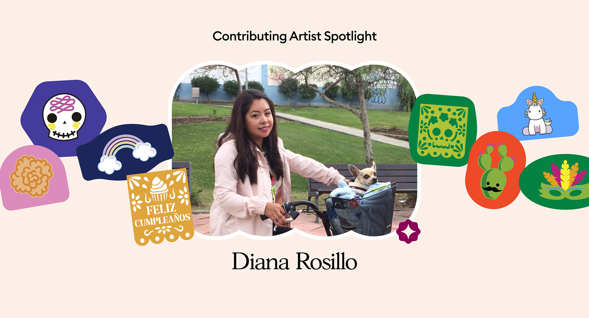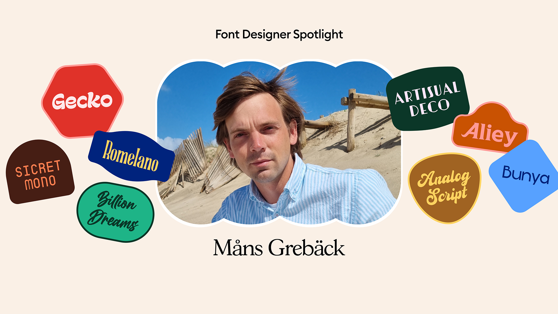
Font Designer Spotlight: Måns Grebäck
A chat with the man behind the fonts
In the world of typography, Måns Grebäck is a name that resonates with creativity and innovation. From his early fascination with graffiti to becoming a renowned font designer, Grebäck’s journey is a testament to his unwavering passion for letter art. In this insightful Q&A session, we delve into the mind of the man himself, exploring his inspirations, design philosophies, and the unique touch he brings to his font creations. Join us as we uncover the artistic process behind some of his most popular fonts and gain a deeper understanding of the man who has left an indelible mark on the world of typefaces.


What inspired you to become a font designer, and how did you get started in this field?
I drew letters from a young age and became interested in graffiti in my teens. Some of my first fonts were graffiti fonts, and I still create such designs now and then.
Besides my pure graffiti style fonts, many of my brushes and comic typefaces are also street art inspired.
Making letter art, I created my first fonts as a personal project for fun to see if I could do it. I uploaded it to the internet and pretty much immediately found an audience who appreciated my work. And with my passion for type, I simply continued doing the same thing, and have continued doing so ever since.
How would you describe your design style, and what sets your font designs apart?
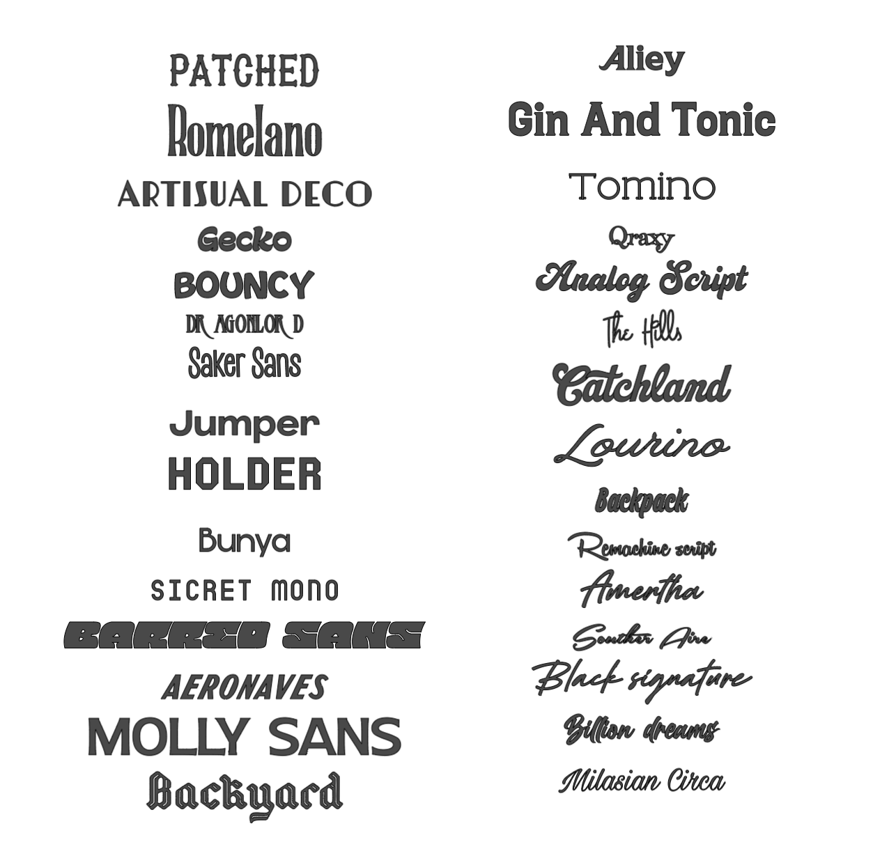
I want to be versatile, and that’s why I draw fonts of all styles. With that said, script fonts are somewhat of a specialty of mine, being the perfect mix of challenging and rewarding A style that is popular on the market and at the same time very fun to design.
I strive to have my fonts be of good quality with a large set of characters to be able to be used in a large part of the world.
My hope is that my fonts differentiate themselves from other by being created from passion.
I even want them to be slightly unconventional, which I believe enhances them with a touch of life and creativity.
Furthermore, making them just a bit out of the norm brings the potential of finding a new design feature.
As if each font has a small, experimental mutation. And they will always be unique.
Can you walk us through designing and developing one of your most popular fonts?
One of my most popular fonts throughout the years is Remachine Script, a font that is inspired by that beautiful, hand-painted advertisement lettering of the 1950’s.
Drawing it was a fun and stimulating process, as I wanted to maintain the vivacity of the brush strokes, all the while creating a font that was legible and dynamic enough to work in typesetting.
I studied samples from posters, and looked at how they seemed to move the brush with a certain relaxed but confident stroke.
Finding patterns and understanding the style, I proceeded to paint and draw my own versions.
I work almost exclusively digitally, in programs such as Illustrator. I sometimes use brushes, but also rely heavily on the normal pen tool to draw vectors.
When I was just about finished with it, I remember that I was happy with the result. But coming back looking at it the next day, I still thought it could be improved, and decided to redraw almost all the letters. Same style, but new versions. I want to believe that is what led to its success – giving it a chance to become better.
I have later drawn an Arabic version of the font, which was a challenge in itself.
How do you stay updated with the latest design trends and incorporate them into your font designs?
I do not actively try to stay up with trends. My philosophy is more of creating what I think is intriguing at the moment; what I have inspiration to make.
However, I am not immune to influences, and nor do I try to be, so of course my work follows trends too.
What is interesting to create is also depending on what is popular, since it’s fun to have many people use my work.
Hence, it’s more of an automatic process rather than something I pursue.
What are some of the most rewarding experiences you’ve had as a font designer, and what do you enjoy most about your work?
I am extremely lucky to have a job with many rewards, from being paid to do what I love, to seeing my work being used on a daily basis.
But there are two main things that I have found specially rewarding in my career:
The first is when I see someone using my typefaces, when that someone has in turn been an inspiration to me. For example, seeing my font on the cover of a musical artist that I use to listen to when I draw letters. The second is when someone writes to me without any reason, but simply to affirm that they recognize that an actual person drew the font they like. The reason I find this touching is because I don’t expect anyone to consider who makes the letters. Most people don’t even realize there’s a person behind the designs.
Find these exclusive fonts in Design Space and visit Måns Grebäck for more!
You Might Enjoy…