Take the guesswork out of pairing colours
Colour takes on a different meaning for everyone, and we all have different preferences based on our personal experiences and individual outlooks. But colours can be used to create a mood and evoke an emotional response when you enter a space. For example, a space can have a dynamic, tranquil, romantic or even contemplative mood. Colour can also be used to control temperature, or how a colour feels in a space.
Where to Begin.
Once you understand what emotion you want to evoke, our Design Team often starts with a single colour that ties to that emotion and then builds complementary colours around it.
So how do you decide on complementary colours?
Another way is to start with your primary colour and find its complementary colour (the one right across from it on the colour wheel). Then find the colours on either side of the complementary colour. Those two colours and your original colour make up a split complementary colour scheme.
Or the absolute, most simple way to pair colours, is to use the colour palettes below.
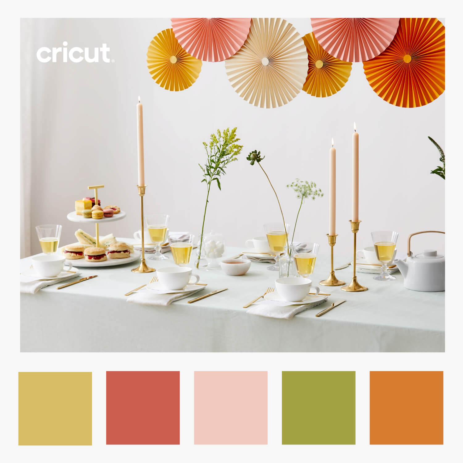
If you are inspired by the table fan decor shown in the image above, step-by-step instructions on how to make them are available in Design Space.
About Cricut Inspiration
Search How-To
I want to make...
Related Making
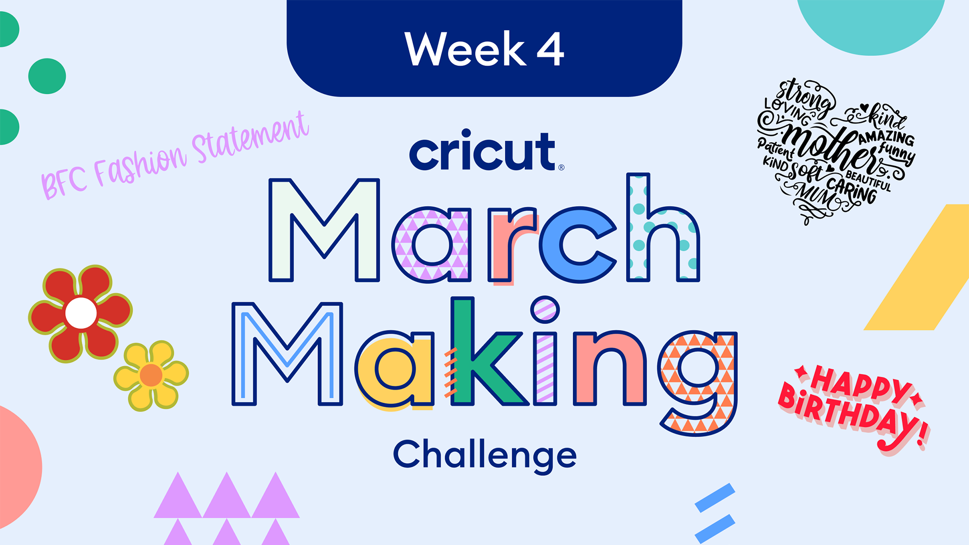
March Making Challenge: Week 4 Free Designs!
Read More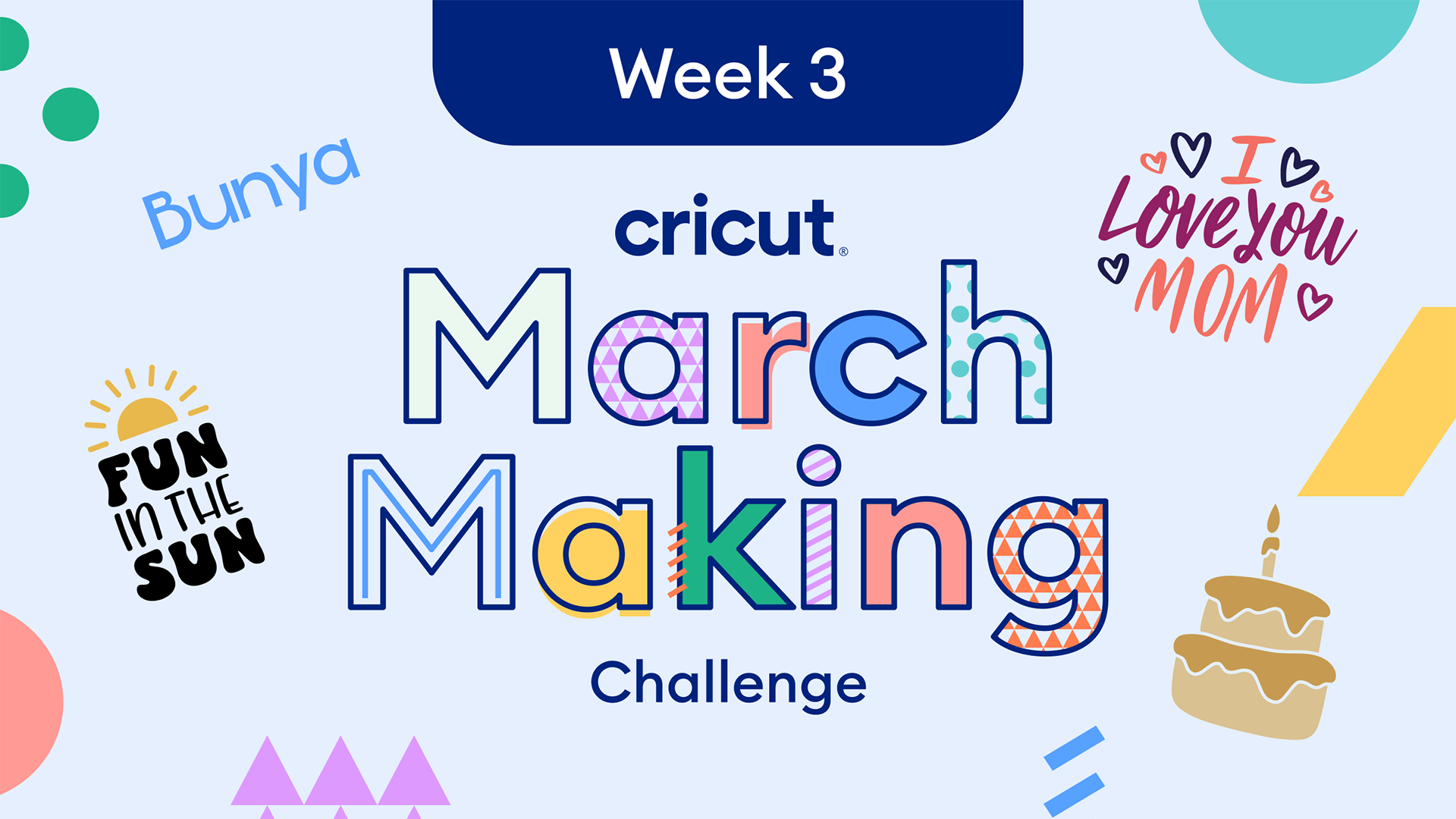
March Making Challenge: Week 3 Free Designs!
Read More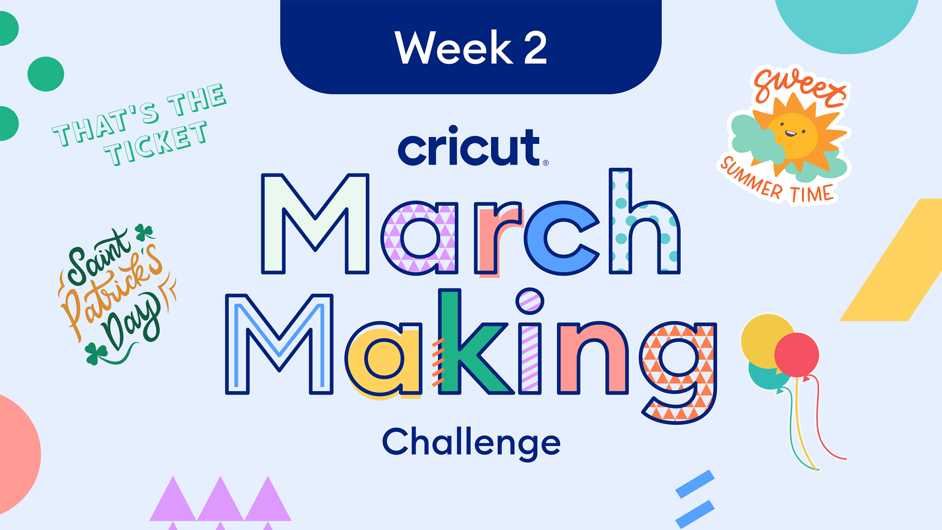
March Making Challenge: Week 2 Free Designs!
Read More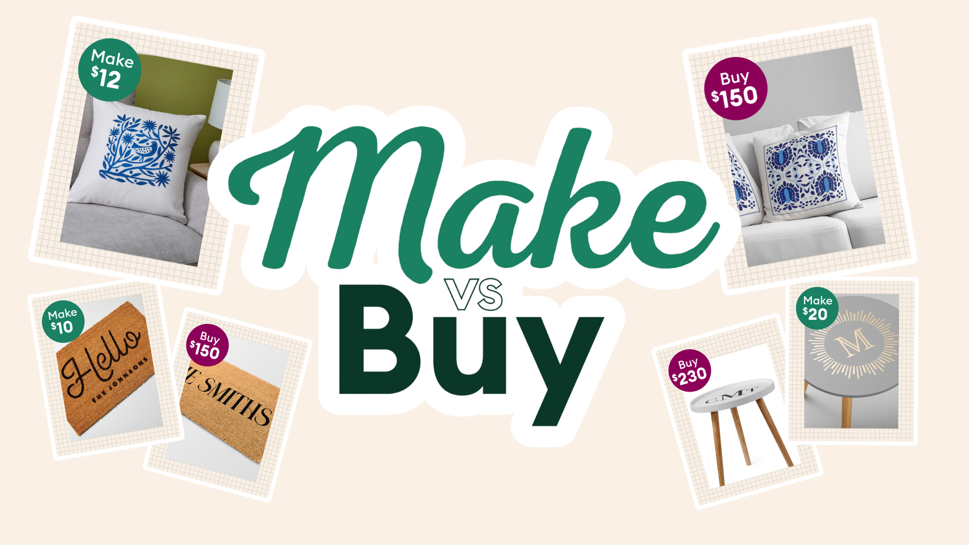
Make vs. Buy with Cricut
Read More
Celebrate National Craft Month with Cricut’s March Making Challenge!
Read More
Newly engaged this Valentine’s Day? Make your wedding stand out with these custom project ideas
Read More
Be the MVP of your big game party
Read More
Creative Christmas tree decorating with Cricut
Read More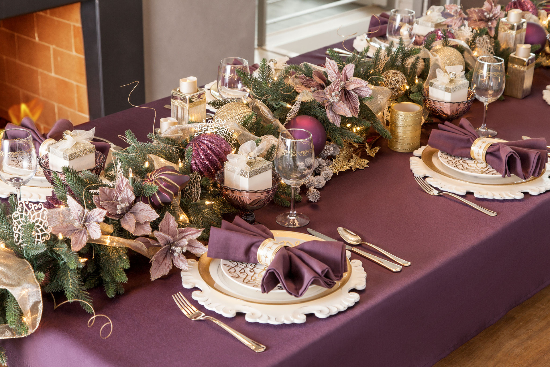
5 ways to elevate your holiday table decor
Read More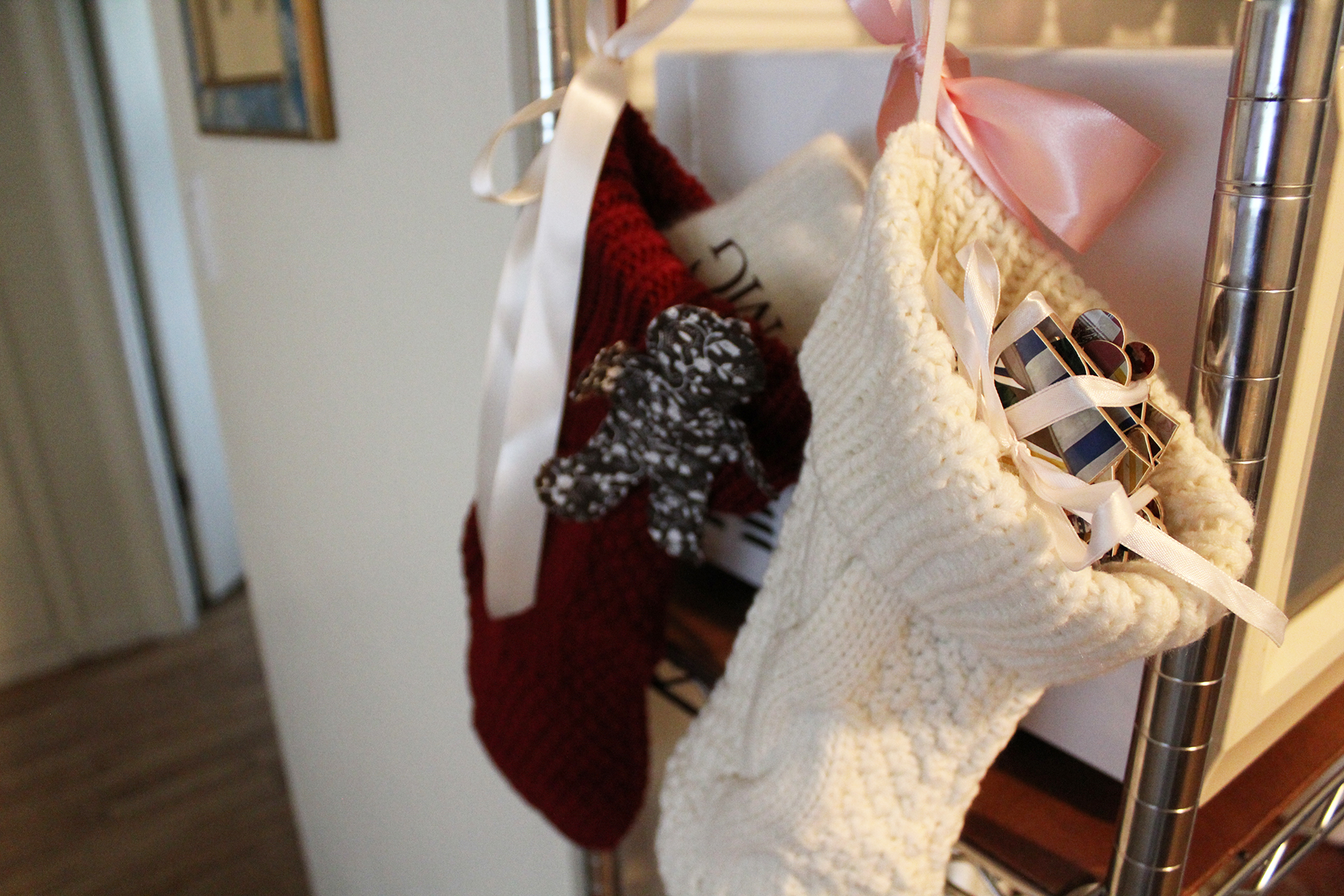
5 DIY stocking stuffers with Cricut
Read More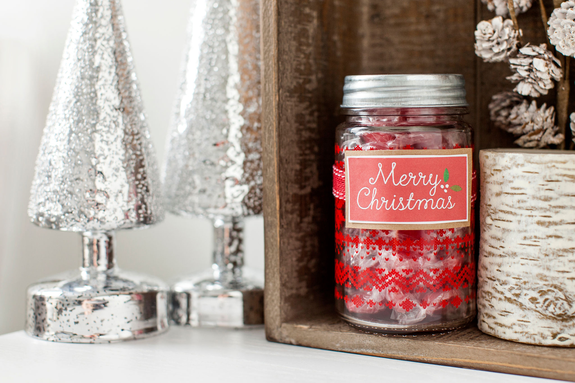
Crafting cheer: 4 festive Christmas projects
Read More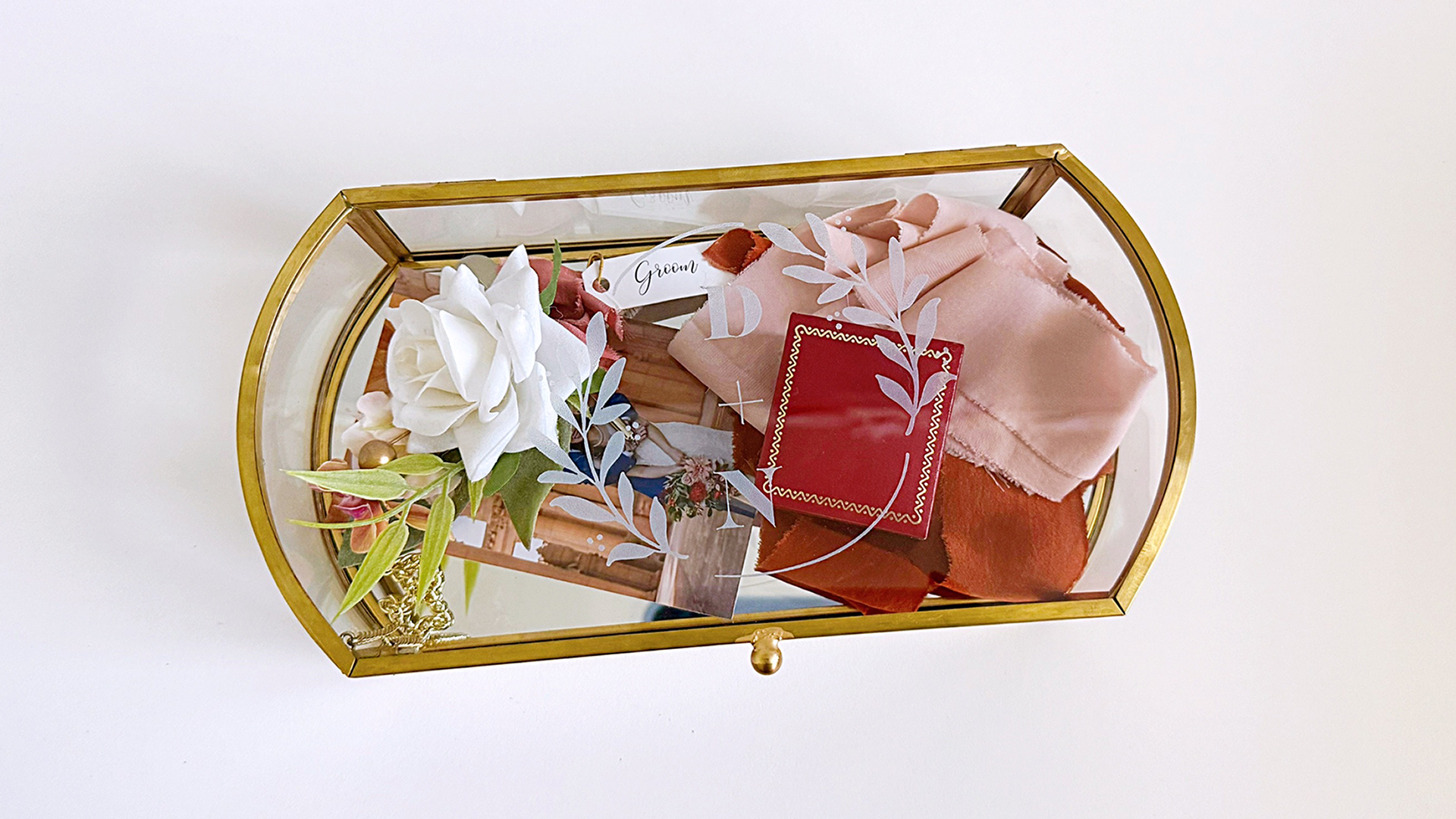
How to achieve an etched glass look using frosted vinyl
Read More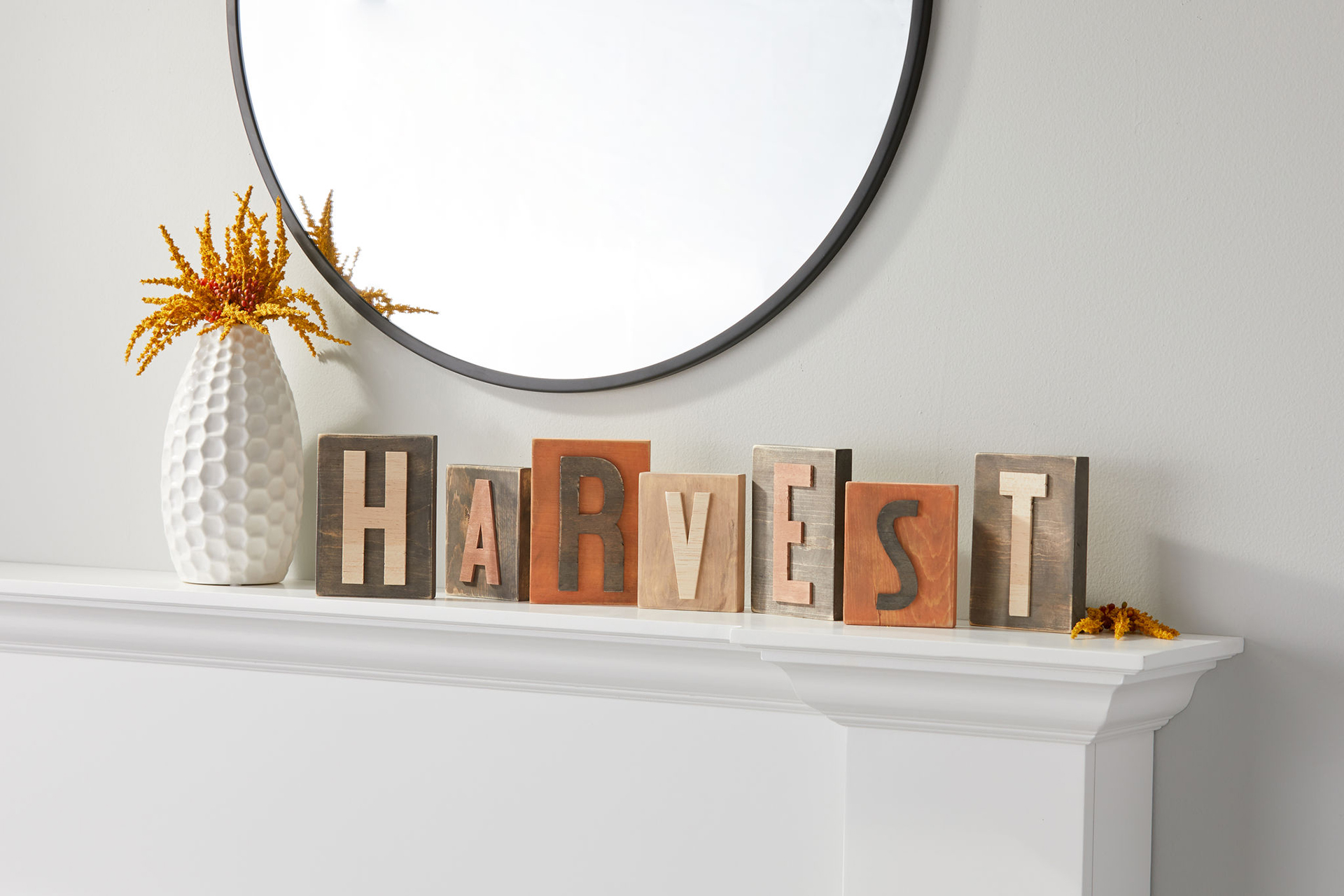
Fall inspired kitchen decor to make with Cricut
Read More
Catch a Cutie and win!
Read More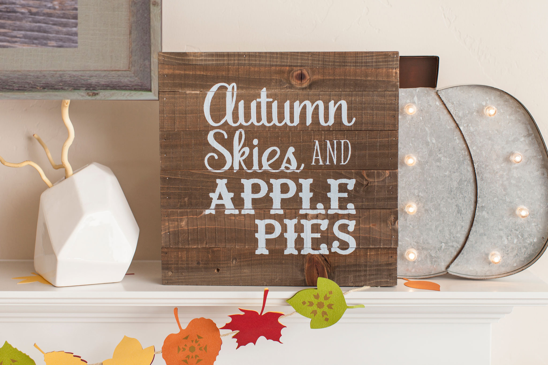
Trendy fall crafts for cozy home decor
Read More